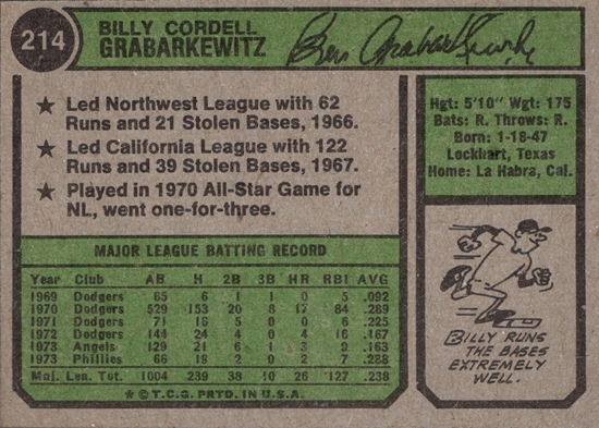
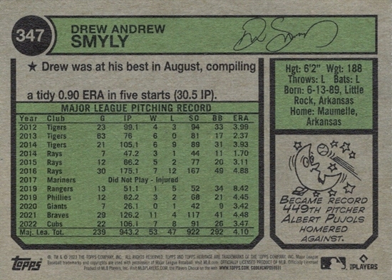
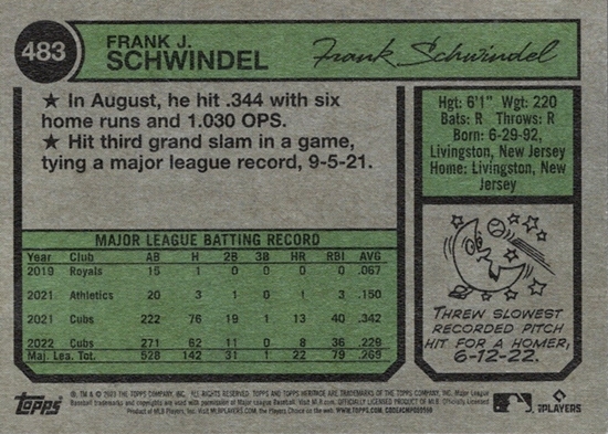
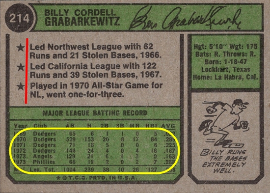
All it takes is a quick look at the original 1974 backs and the 2023 Heritage backs to see some major differences with the spacing, and it's the Heritage cards that look bad. Among the problems, there is too much blank space on the Heritage cards. Additionally, the justification with the bullet points on Heritage is wrong. The second line goes to the far left instead of lining up with the first line's text. Doing it this way sorta hides the star instead of highlighting it.
See what I mean? Heritage just looks bad. Why doesn't anyone at Topps notice that? Am I looking at it too critically? Anyone else notice it?
Why couldn't the cards have been made to look like this, evenly spaced, no big empty spots, and the stars set apart from the text?

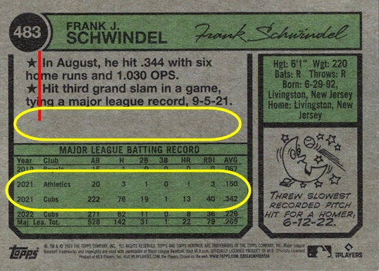
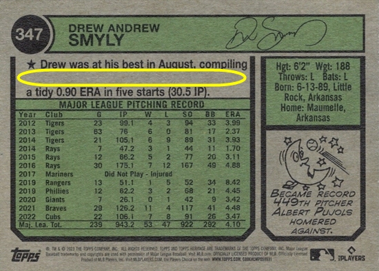
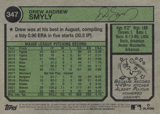

Yes, I mentioned this on my first Heritage post. The backs are sloppy. I'm guessing there's a generally feeling at Topps (and in general) that few collectors pay attention to the backs these days, so Topps dedicates fewer resources to them. It's only vets like us that notice it.
ReplyDeleteThe vets and set builders care about consistency, tradition, accuracy AND the backs, but the breakers and big hit chasers are only concerned about details concerning gold foil serial numbers and the like. The latter group will purchase shoddy product without blinking. So why would Topps spend money on creating a superior product when being mediocre has proven to be financially successful?
ReplyDeleteThis is actually one of the two main reasons I stopped collecting new product.