Modern Topps sets use consistent colors for all the cards of a particular team. For example, the Cubs 2018 cards....
...feature a blue waterslide, a blue band for the player's name and a red band for the team. Other teams saw their cards using different colors. Most recent Topps designs match the card colors with team colors.
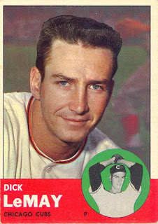
Topps cards haven't always used this design scheme. Sets from many of the early Topps years varied the colors on the cards in a random way. Cubs cards showed a rainbow of colors. Every set from 1954 through 1961 was this way.
The 1962 design was a big change. The wood grain border was the same on every card. They went back to random colors in 1963. After that Topps went to giving teams different colors. The Cubs often had orange as their color.
In 1967 Topps switched up the color of the name and position. The 1970 has a slight variation as the color of the team name changed. The 1975 set is famous for it's multi-colored borders. Fifteen years later, the 1990 set had varied border colors too. And since then, no set has had variations among a particular team. That design component has disappeared from Topps.
Here's the years when the colors varied randomly, along with what was different:
1970 - team name colors
The 1962 design was a big change. The wood grain border was the same on every card. They went back to random colors in 1963. After that Topps went to giving teams different colors. The Cubs often had orange as their color.
In 1967 Topps switched up the color of the name and position. The 1970 has a slight variation as the color of the team name changed. The 1975 set is famous for it's multi-colored borders. Fifteen years later, the 1990 set had varied border colors too. And since then, no set has had variations among a particular team. That design component has disappeared from Topps.
Here's the years when the colors varied randomly, along with what was different:
1954 - the background and player name font
1955 - the band with the player information along with the font color for the name and position
1956 - the name and team bands
1957 - font colors for the name, team, and position
1958 - background colors, position and team band, font color for name, team, and position
1959 - Matte color, font color for name, team, and position
1960 - background of small picture, band at bottom, font color for name, team and position
1961 - boxes with name and team plus the font colors
1963 - circle background, band color, font color for name and team
1967 - name and position color
1970 - team name colors
1990 - border colors
Over the next couple weeks I'll be taking a look at each year and give you a look at how many Cubs cards there were for each color combination.


Never noticed before how similar 1975 and 1990 Topps are.
ReplyDelete